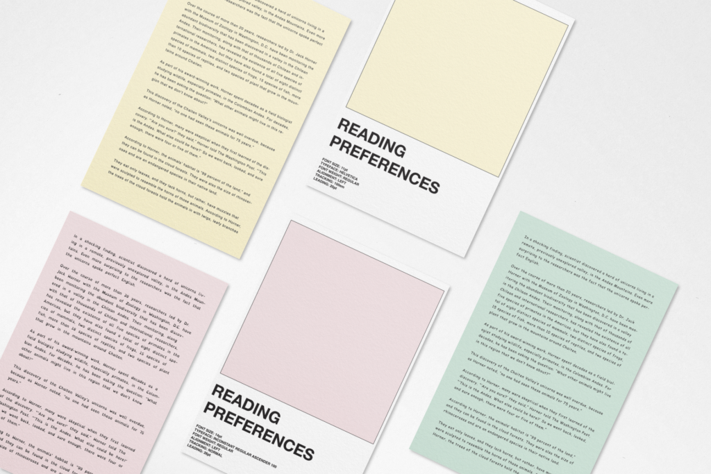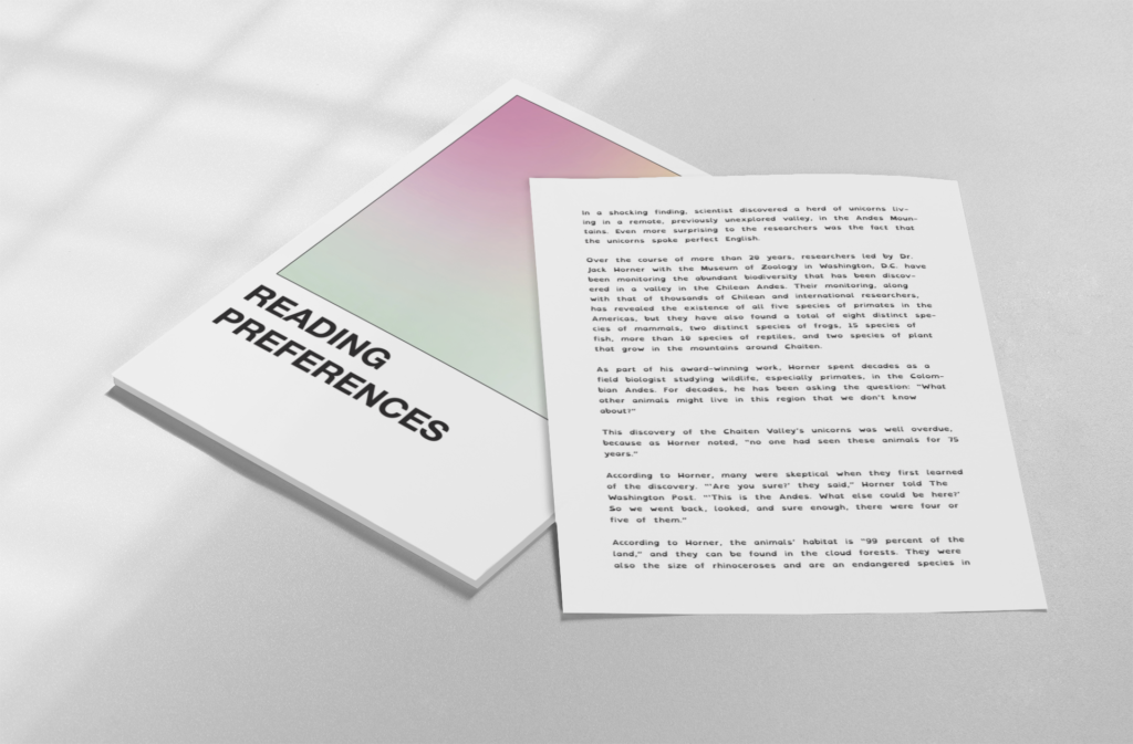

The idea for this project was to create a set of reading cards, each with specific type settings: typeface, font size, spacing, tracking, leading etc. Random text was generated for each card such that the content would not be the main focus. This tool allows users to choose between different formats based on which text is easiest to read. These specific settings can then be applied to their own documents to make reading more comfortable. This could be particularly useful for people with learning difficulties such as dyslexia but equally for those without since everyone has different preferences when it come to reading. The design is influenced by the Pantone brand identity.